120-christian-website
Christian website newsletters
At Websites4Christians we get asked a lot about what works for a christian website newsletter. So I thought that I’d start off by writing a short technical note. This doesn’t focus on the detail of what to include in the Christian website newsletter but instead focuses on two important issues: images and fonts. I’ll write some more on the other issues over the next few weeks (see Christian website Pt 2) but for now I wanted to focus on images in particular.
Technical notes on writing a newsletter
Newsletters can be a powerful way of reaching your members and those interested in what you as an organisation are doing. However they can be tricky to get right technically. What will work for one person won’t work for all. There are two technical aspects worth considering with email: Images and fonts.
Images
Today there are lots and lots of email clients available for users. Some of them display images and some of them don’t. It is possible for users to turn image display on but in practise many don’t. The main clients on the web are:
| Client | Default image display | Estimated market share |
| Yahoo | On | 16% |
| Windows Live | Off | 2% |
| Gmail | Off | 5% |
| Hot mail | On | 15% |
| Aol | On | 0.9% |
Desktop clients have a similar spread of image displaying:
| Client | Default image display | Estimated market share |
| Outlook 2007 | Off | 40% |
| Outlook 2003 | Off | |
| Apple Mail | On | 8% |
| Thunderbird | Off | 1% |
| Aol (desktop) | Off | 0.35% |
In short image based emails are often unlikely to be successful. If your Christian website newsletter uses them you might find your readers aren’t reading them because they can’t see them! The images won’t be displayed on a large number on email clients. An example of such a mail sent to the author (using Gmail):
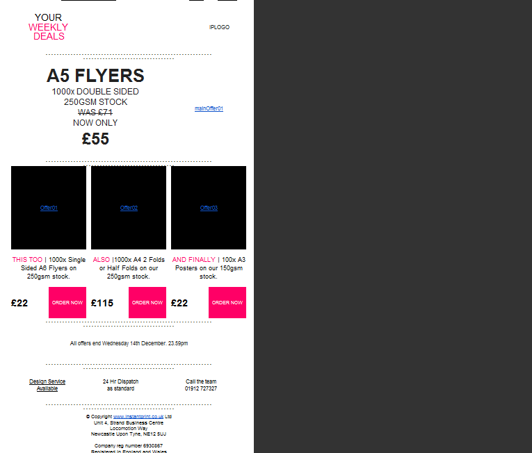
As you can see the impact of the mail is completely lost. The offers (four of them) are completely lost and the message fails to deliver. The mail should have looked like this:
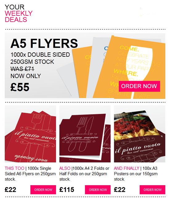
This image looks great and could easily attract attention but without the images options switched on the message looks bare.
The company have tried to overcome these difficulties by writing the mail in a way that overcomes the difficulties. They have put the offer in text not images and have tried to make it easy for the user to see what is being offered.
The part that the company can’t overcome is that over 60% of the ad area is an image and so it’s not attractive to the reader. Generally they’ll skip the mail.
Best practise for Christian website mailings remains to keep them image free or at least to reduce the dependence on images to get the point of the mailing across.
The easy way to test is to simply remove the images from the message and then see whether the message still comes across.
If you’re still keen on using images then a solution that is used more and more is to create a webpage on your Christian website with all the graphics etc. and have a link in the email to that page. The page is “hidden” from normal Christian website users but available by clicking the link (note you could also make a feature of back issues of your Christian website newsletters – more content).
Fonts
Fonts can make a mail look interesting and can help to set apart certain parts of the message. Unfortunately support for font types is very varied. Currently it is though that the following fonts are “safe” (that is will show on 99% of views):
• Arial, Helvetica, sans-serif
• ‘Arial Black’, Gadget, sans-serif
• ‘Bookman Old Style’, serif
• Comic Sans MS’, cursive
• Courier, monospace
• ‘Courier New’, Courier, monospace
• Garamond, serif
• Georgia, serif
• Impact, Charcoal, sans-serif
• Lucida Console’, Monaco, monospace
• Lucida Sans Unicode’, ‘Lucida Grande’, sans-serif
• MS Sans Serif’, Geneva, sans-serif
• MS Serif’, ‘New York’, sans-serif
• Palatino Linotype’, ‘Book Antiqua’, Palatino, serif
• Symbol, sans-serif
• Tahoma, Geneva, sans-serif
• Times New Roman’, Times, serif
• Trebuchet MS’, Helvetica, sans-serif
• Verdana, Geneva, sans-serif
• Webdings, sans-serif
• Wingdings, ‘Zapf Dingbats’, sans-serif;
These normally work as normal, bold, italic, underline and combinations of these type faces.
Using other fonts may or may not be successful so avoiding them seems to be a sensible approach. It’s also worth noting that many email programs will only show black text (including bold, italic, underline etc.) so using colour will not always work.
So in summary for a Christian website remember to check your fonts will work and exclude images from the email.
Leave a Reply
Archives